2014
2014
AMERICAN
AIRLINES
AMERICAN
AIRLINES
GRAPHIC DESIGN
OVERVIEW
OVERVIEW
American Airlines has been beloved by Americans over the years. However, American Airlines slowly lost brand power while other competitors showed a strong brand identity to customers. American Airlines lost its brand identity, only showing AA symbols. Also, these symbols were no longer tempting to customers. I set American Airlines as a hypothetical customer and started to rebrand American Airlines in 2013. I'm glad that they changed their brand identity and renewed it's brand identity in 2013 at the same time.
American Airlines has been beloved by Americans over the years. However, American Airlines slowly lost brand power while other competitors showed a strong brand identity to customers. American Airlines lost its brand identity, only showing AA symbols. Also, these symbols were no longer tempting to customers. I set American Airlines as a hypothetical customer and started to rebrand American Airlines in 2013. I'm glad that they changed their brand identity and renewed it's brand identity in 2013 at the same time.
American Airlines has been beloved by Americans over the years. However, American Airlines slowly lost brand power while other competitors showed a strong brand identity to customers. American Airlines lost its brand identity, only showing AA symbols. Also, these symbols were no longer tempting to customers. I set American Airlines as a hypothetical customer and started to rebrand American Airlines in 2013. I'm glad that they changed their brand identity and renewed it's brand identity in 2013 at the same time.

CONCEPT
CONCEPT
American Airlines brand was not tempting to customers anymore. Re-branding was necessary for the American Airlines brand. They used the same logo for more than 30 years. Alsom AA did not stand for anythiung. Re-positioning was also necessary for this brand. For solving thios problem, I aimed the new brand word" future" building a new future with cumstomers.
American Airlines brand was not tempting to customers anymore. Rebranding was necessary for the American Airlines brand. They used the same logo for more than 30 years. Also, AA did not stand for anything. Re-positioning was also necessary for this brand. For solving thios problem, I aimed for the new brand word" future" building a new future with customers.
American Airlines brand was not tempting to customers anymore. Re-branding was necessary for the American Airlines brand. They used the same logo for more than 30 years. Alsom AA did not stand for anythiung. Re-positioning was also necessary for this brand. For solving thios problem, I aimed the new brand word" future" building a new future with cumstomers.
DIRECTION
DIRECTION
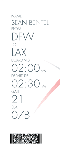
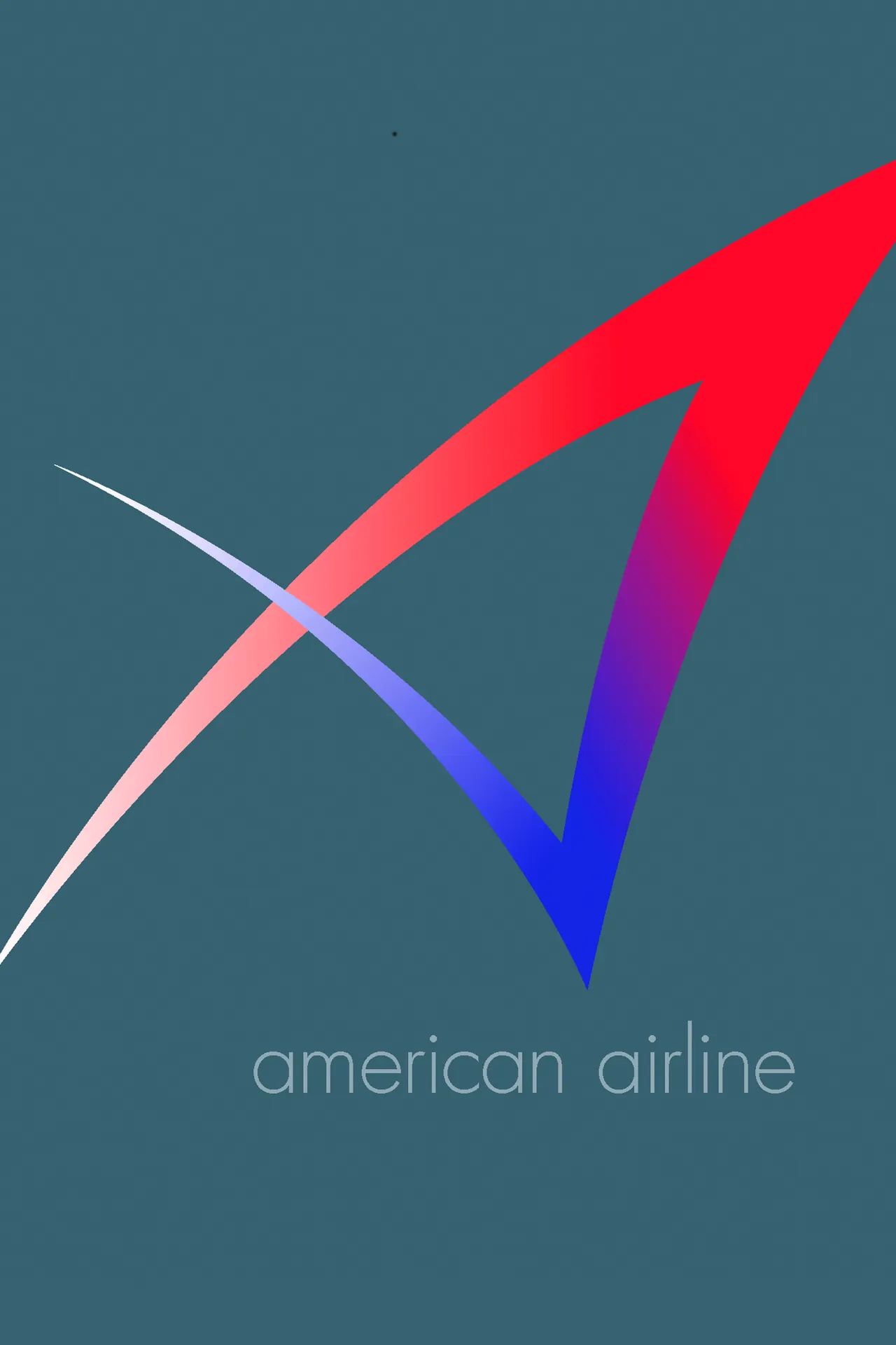
Rebranding was a huge challenge. The new logo had to convey a futuristic mood instantly to customers and include American symbols. My conclusion was simple, but it contained complicated meanings. Once the core logo was defined, I applied the design to the various forms.
Rebranding was a huge challenge. The new logo had to convey a futuristic mood instantly to customers and include American symbols. My conclusion was simple, but it contained complicated meanings. Once the core logo was defined, I applied the design to the various forms.